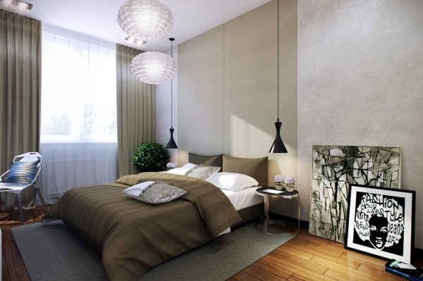
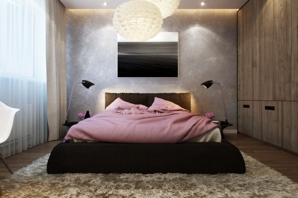
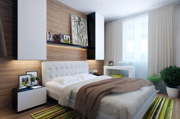
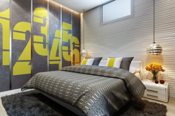
While we may all dream of expansive bedrooms with tulle canopies draped over our princess beds and closets the size of houses, modern urban living rarely allows for these kinds of square footage indulgences. Instead, we have to make do with the space we have. Visualized by Artem Lazarev, each of these bedrooms makes up for its lack of space with carefully chosen furnishings, modern design aesthetic, and an overall attention to detail in order to make the most of every inch.
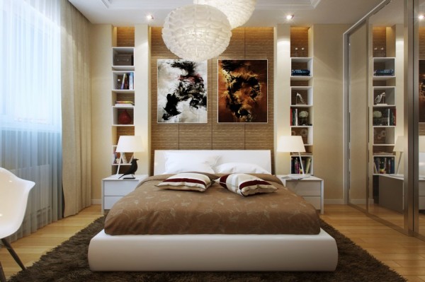
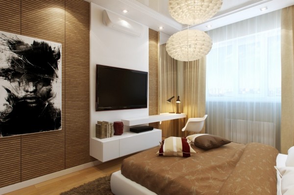
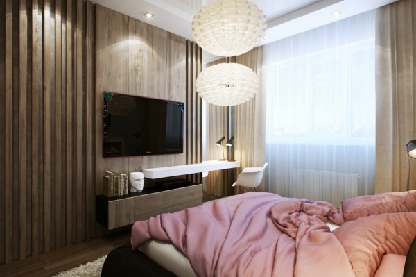
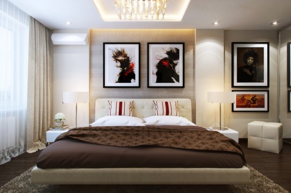
The bamboo-esque wall coverings in this bedroom give it a warm and cozy feeling while the subtle glow from the overhead fixtures and gauzy curtains is the perfect amount of welcoming light.
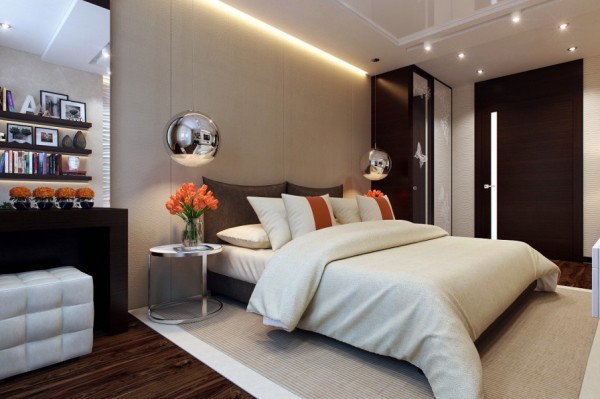
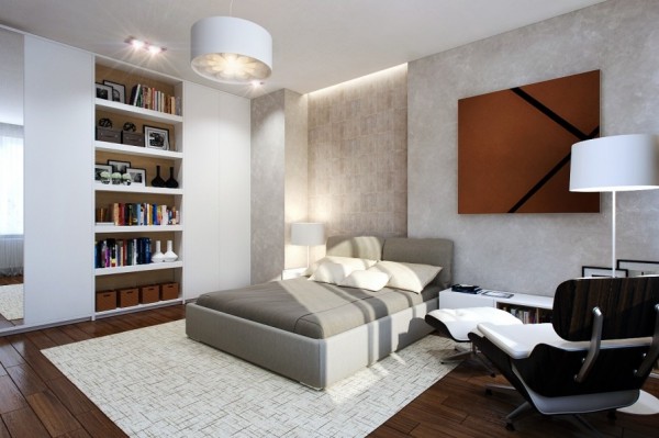
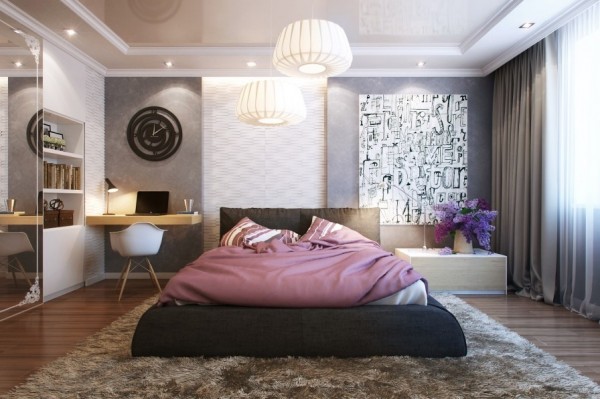
It is important for any bedroom to reflect the personality of whoever sleeps there. This bedroom could easily be home to a booklover with its extensive built in shelving. By nestling the shelves into the wall, less floor space is compromised, giving the small room a more open feelings.
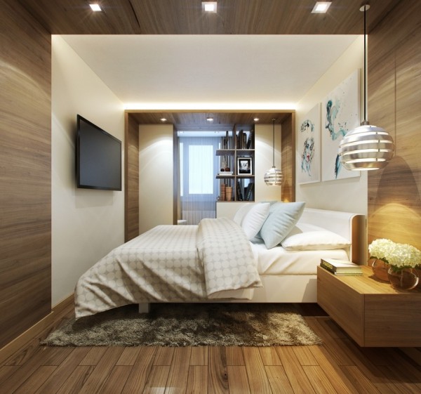
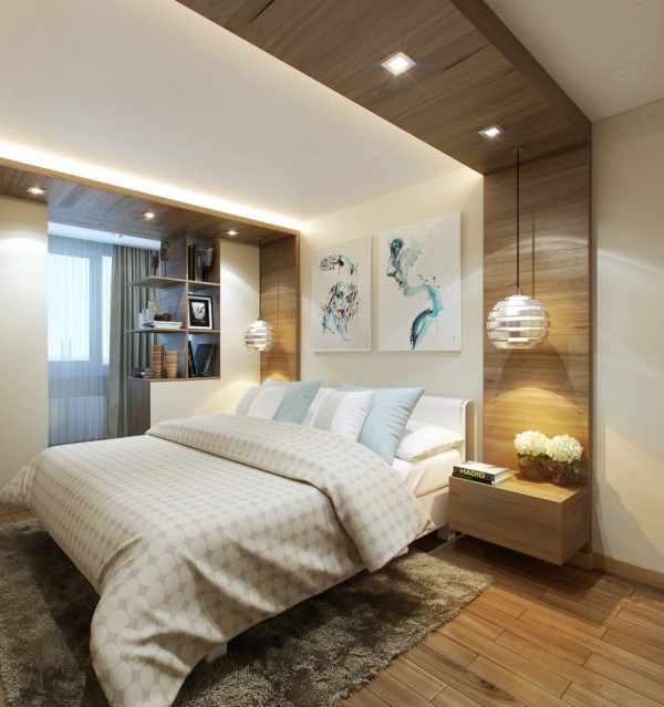
This room uses dividers to great effect with a wood panel running across the ceiling and hanging dividers cordoning off a small reading nook. By adding more separate spaces, the room becomes more comfortable if not any bigger.
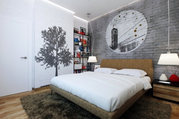
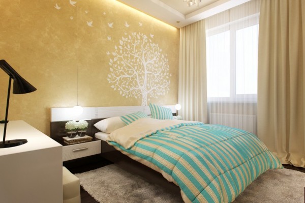
Rather than hang art on the walls, this bedroom lets the walls become art with a brick stencil over the headboard and a shadow tree painted by the door. Leaving the walls essentially bare is another way to give the illusion of more space.
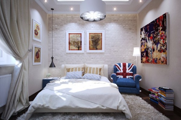
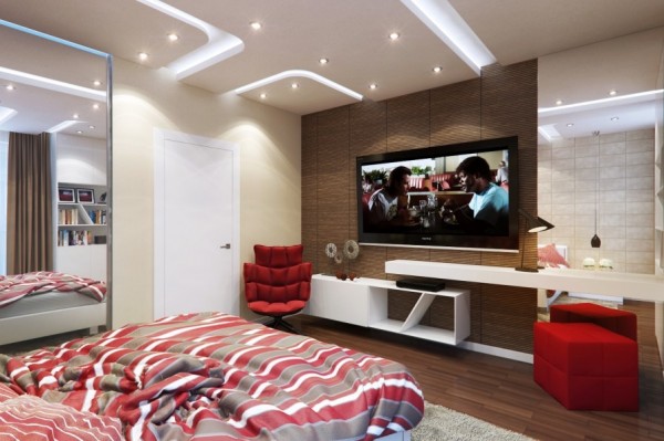
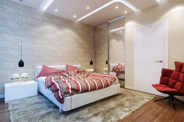
Even a small bedroom has space for seating. Small cushions and a cozy chair nestled in one corner make this a comfortable place to be, even if you’re not ready for sleep.
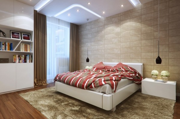
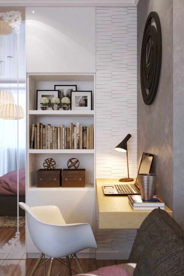
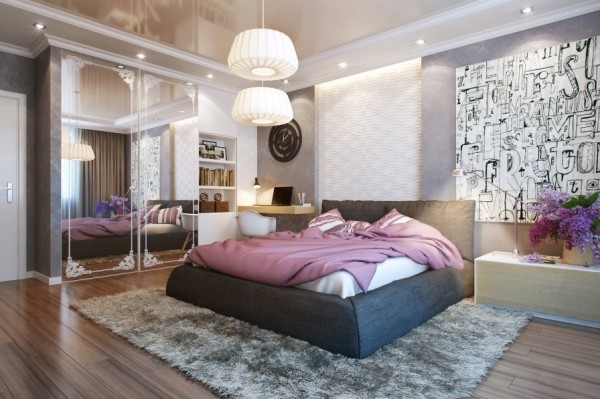
Every room feels a bit bigger with plenty of light. This bedroom features two hanging fixtures as well as plenty of recessed halogen lighting in the ceiling and of course a full-length window.
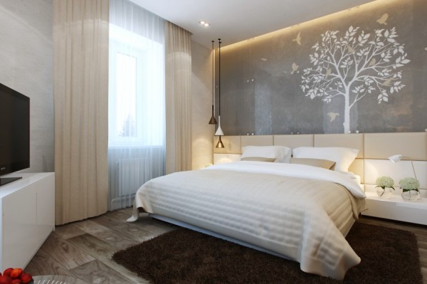
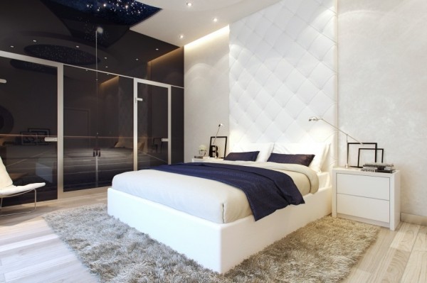
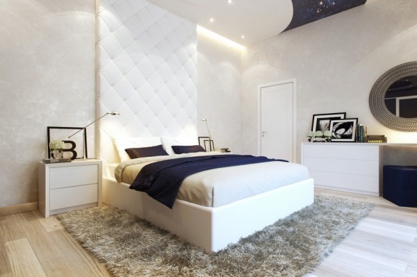
The white on white design in this room makes it feel that much more open from every angle. Of course, the vaulted ceilings don’t hurt either.
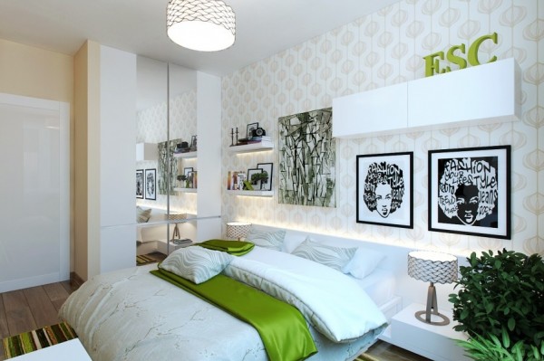
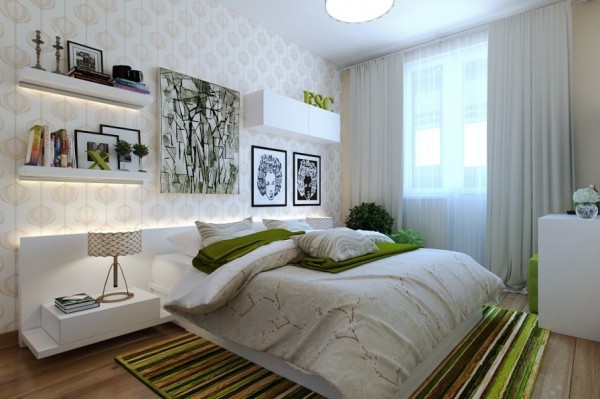
The pops of green in this contemporary bedroom make it feel playful and easy to be in, despite its smaller size.
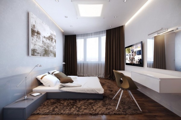
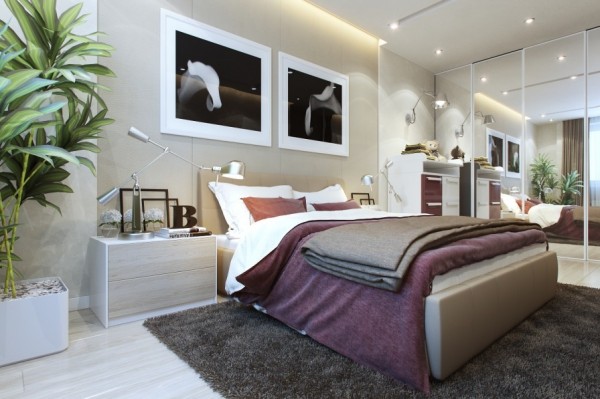
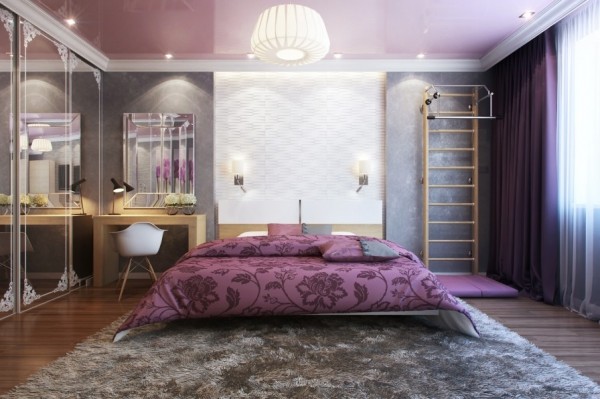
This room uses the classic design trick of including large mirrors to make it feel longer than it is. With a mirror against one wall, the designed manages to slip a narrow desk in opposite the bed to maximize the additional (perceived) space.
For more regular updates from Home Designing, join us on Facebook.

If you are reading this through e-mail, please consider forwarding this mail to a few of your friends who are into interior design. Come on, you know who they are!


 Bathroom Designs From Arlex
 Industrial Loft
 Secluded Luxury House Sporting an Open Design
 A Modern Taiwanese Apartment with a Funky Twist
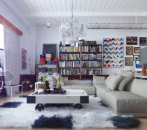 Colorful and Funky Interiors [Visualized]
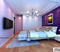 Modern bedroom designs
 Share-kan di facebook


Berminat Dengan Lowongan ini : masukan Komentar anda !
Post a Comment