There are countless ways to decorate a home, so for this feature we are looking at three contrasting home styles, visualized by three different designers. Each space is predominantly of a neutral palette, yet each convey a completely individual feeling and way of living.
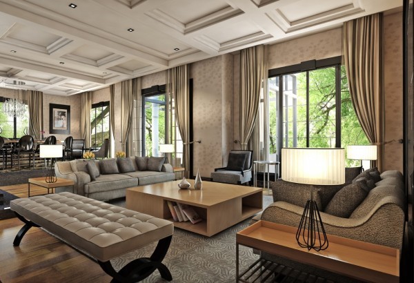
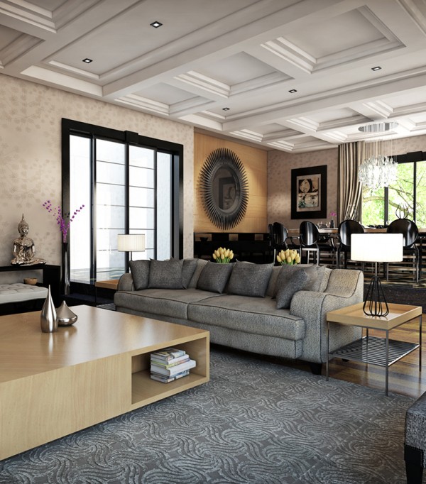
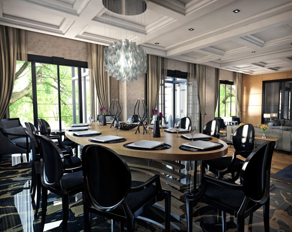
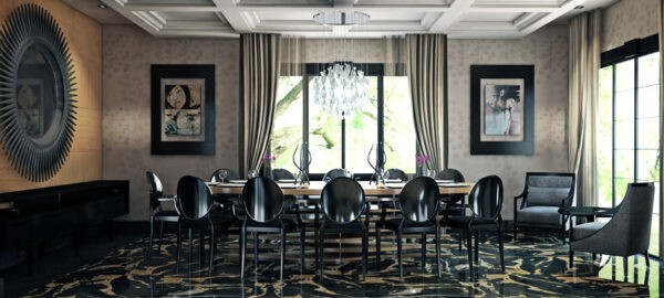
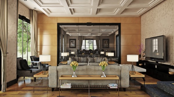
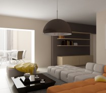
This very formal living space, visualized by Özhan Hazirlar, forms part of a conceptual villa for the Bilkent neighborhood in Ankara, Turkey. The generous 60m2 open plan living zone is part of a total 320m2 house, designed to look out over mature gardens.
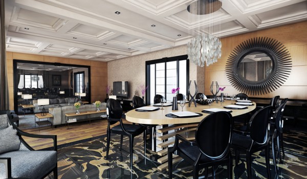
With a design that is inspired strongly by classic silhouettes, and swathed in rich fabrics, this room feels heavy with serious grandeur. The quiet neutral pallet is punctuated with black notes that cut through the cream surroundings, and weight down the pale beech wood tone furniture.
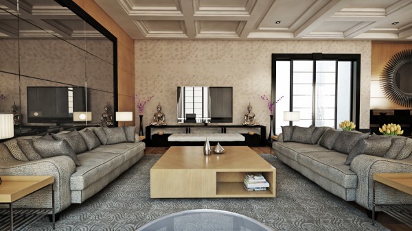
The seating in both the lounge and dining areas stem from traditional designs that have been translated into modern pieces, whilst the tables have been selected for their plain, clean lines as contrast.
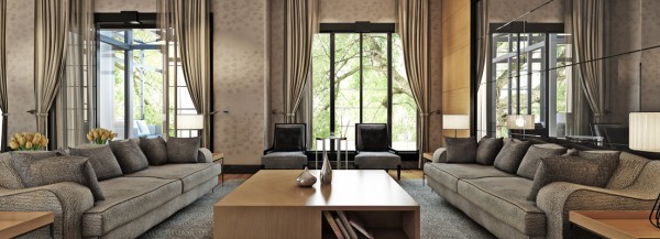
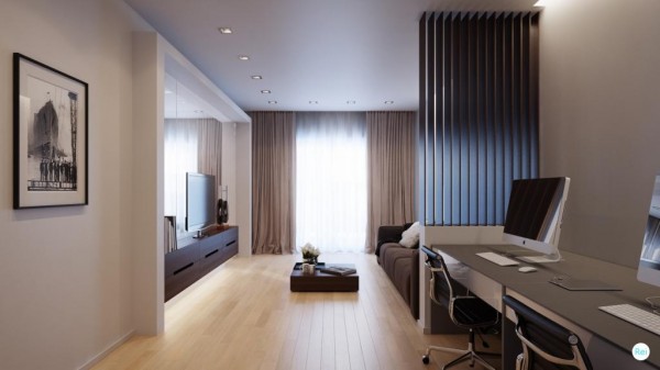
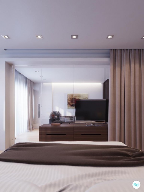
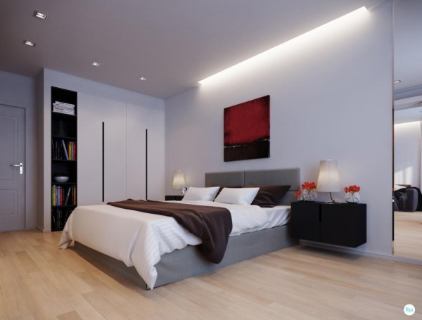
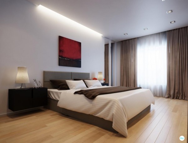
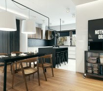
This second space, by R.E.I Studio, offers a much cleaner look. The neutral tones here appear fresh and easy going when teamed with the minimal layout.
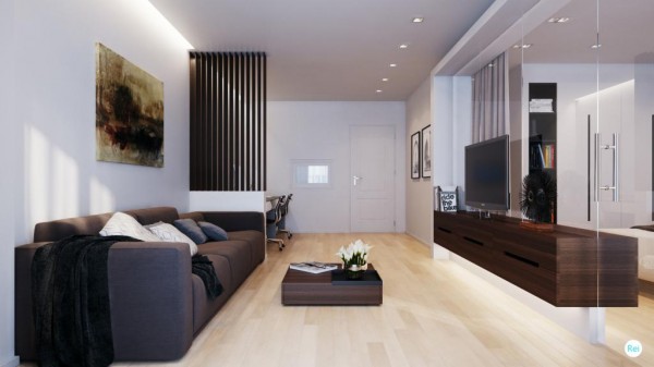
The beech wood floor works nicely along side the richer walnut tone of the sleek entertainment unit and coffee table.
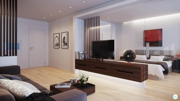
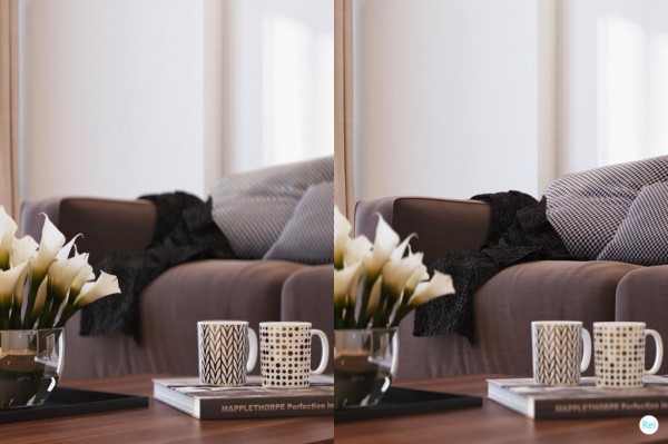
The furniture pieces in this design are strictly contemporary, which keeps the line of the room clean–although possibly a little too simplistic for some peoples tastes. The charcoal gray sofa sports scatter cushions covered with monochrome print fabrics which add a little interest, though a few pops of color would lift the scheme a good deal further.
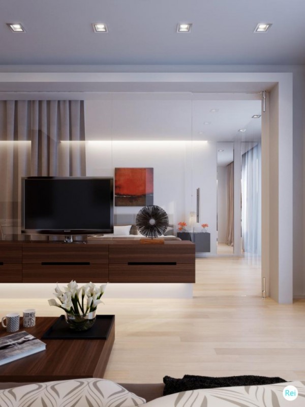
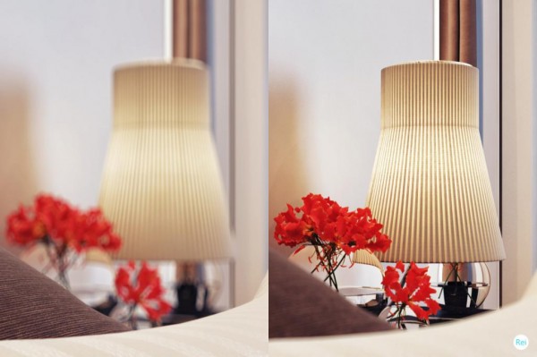
The bedroom is visible though a glass wall where an accent color has been introduced to warm the space; a red floral arrangement picks out red tones in a piece of artwork above the bed.
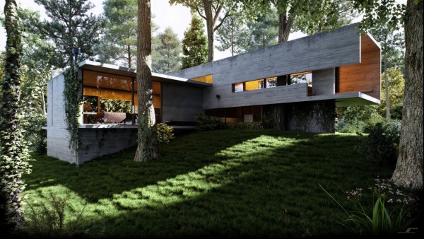
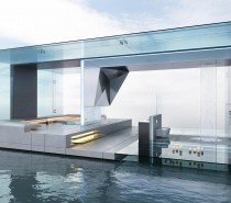
Our last home, visualized by Serkan, is a space-age affair with outer-space flair! The exterior looks completely alien to the softness of the surrounding greenery.
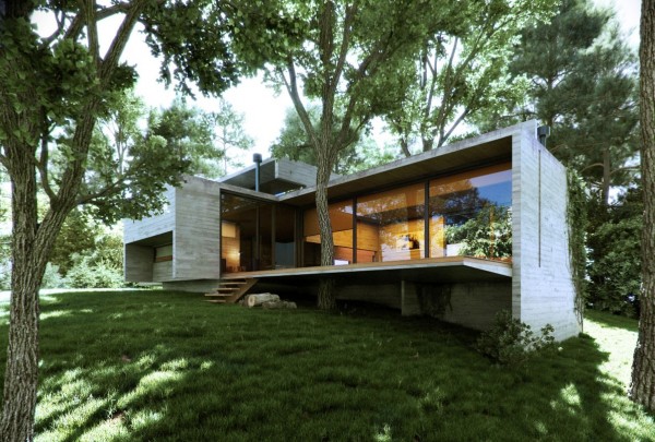
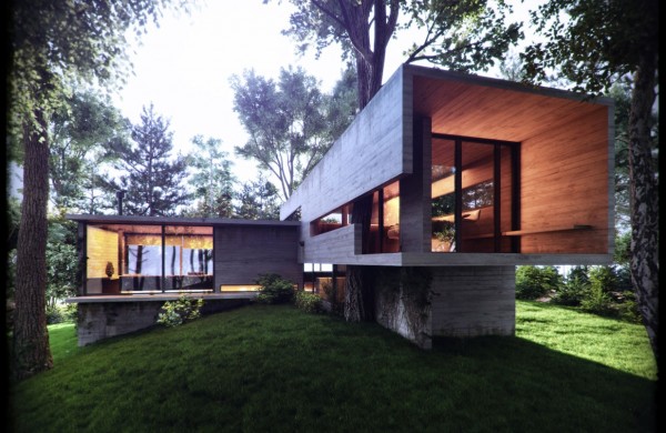
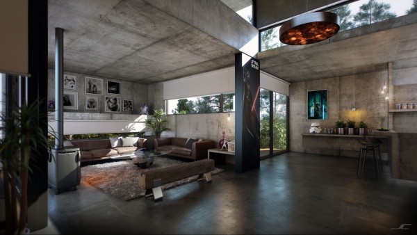
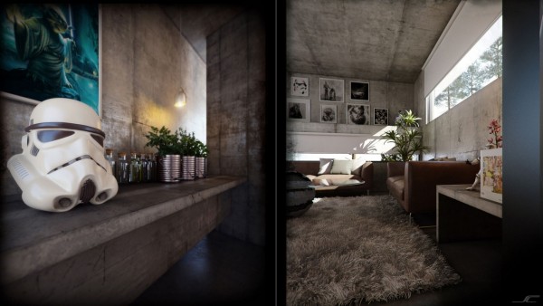
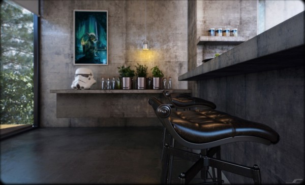
The interior celebrates a mixture of industrial design and memorabilia from cult science fiction movie Star Wars. Exposed concrete surfaces span the ceilings, walls, floors and even the built in furniture, as benches and shelves appear to extrude from the cold perimeter.
For more regular updates from Home Designing, join us on Facebook.

If you are reading this through e-mail, please consider forwarding this mail to a few of your friends who are into interior design. Come on, you know who they are!


 Asian Apartment With Neutral Decor
 Contemporary Sofa Sets from Columbini
 Small Modern Home Visualization
 Modern Bathroom Inspiration 2013
 Classy Living Rooms
 Small Home With Smart Use of Space, Taiwan
 Share-kan di facebook


Berminat Dengan Lowongan ini : masukan Komentar anda !
Post a Comment