The beauty of visualization is that is able to capture the most current trends in interior design. It is such a live medium that changes can be made down to the wire and on the whim of either designer or client. Visualizations such as these, which give substance to modern apartment concepts, are classic examples of the work produced by Triple D Designs. They serve as an indispensible reference for all those artisans who collaborate on a project and a source of stimulation for those members of the greater community seeking interior inspiration.
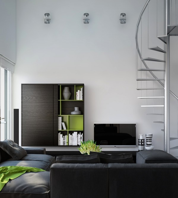
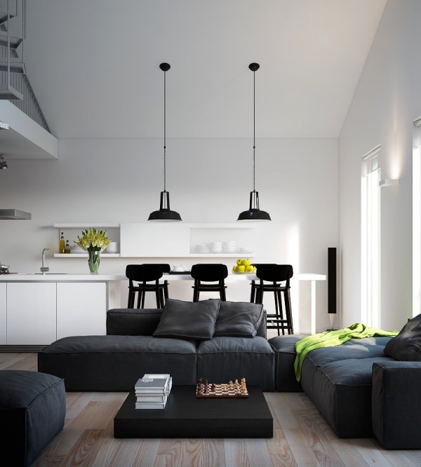
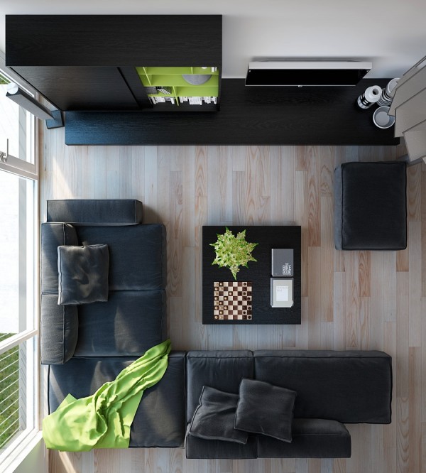
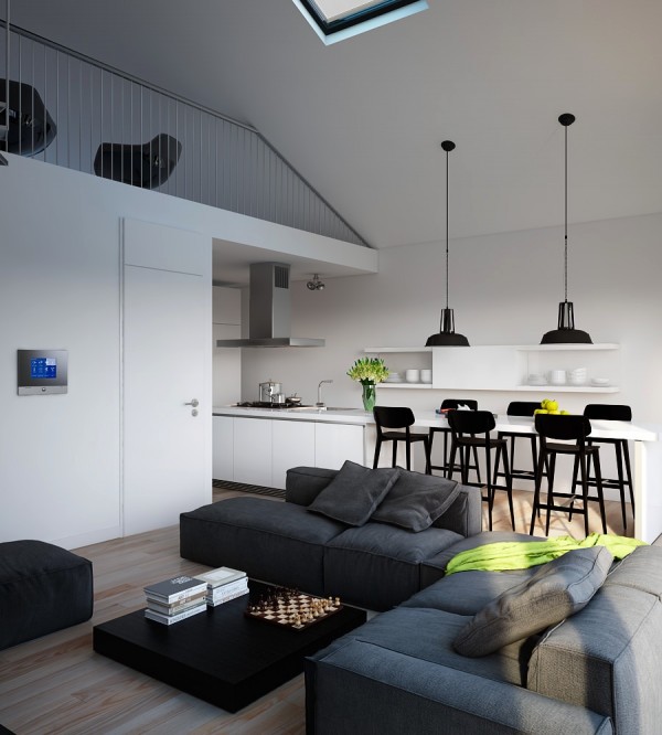
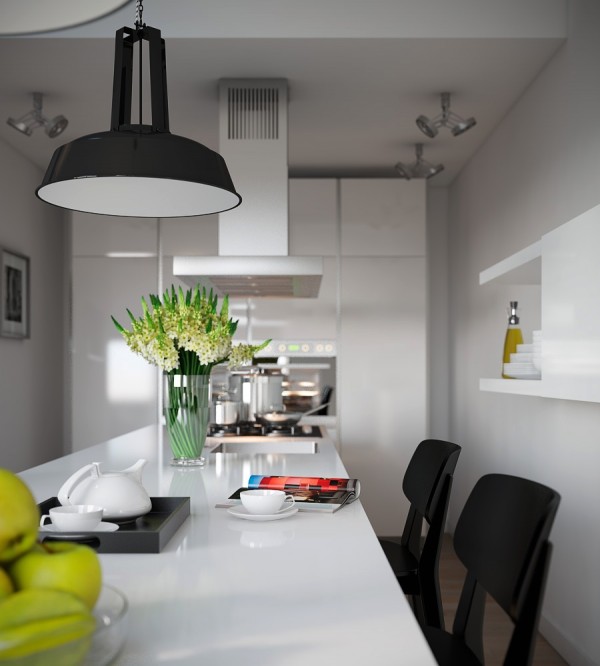
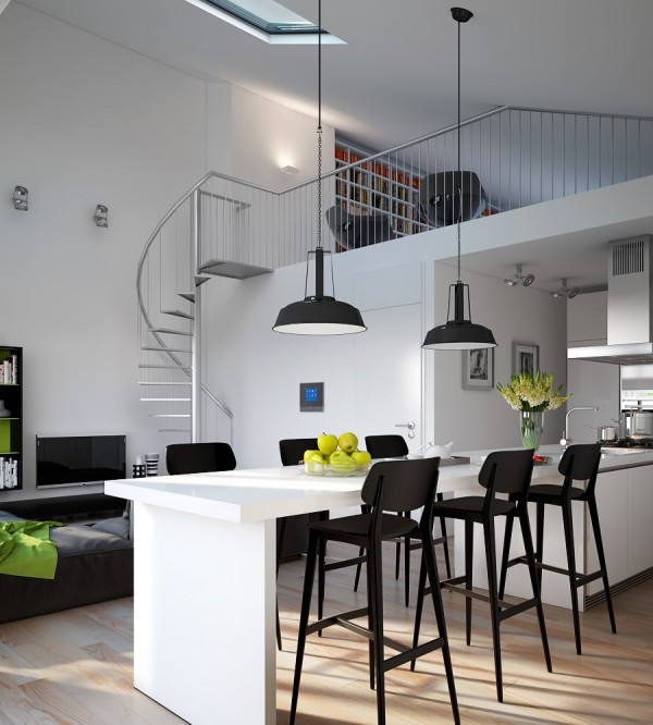
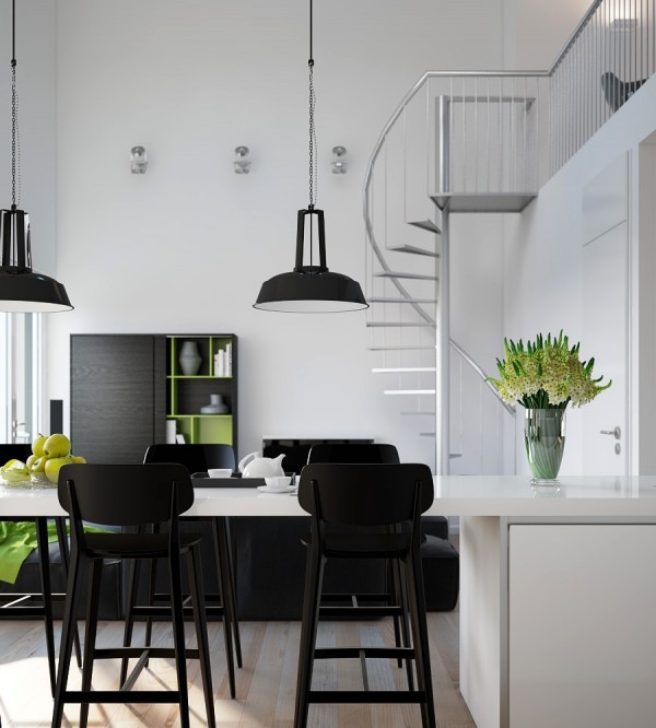
This white-washed, monochrome-styled apartment gives an almost open air, rather than open plan impression, through its incorporation of a skylight, which filters natural light directly into the combined living/ dining and spills into the mezzanine reading room. A monochrome and metallic foundation is softened by blonde wood flooring and verdant accents, which hint at the world beyond the skylight. However sophisticated, the energy within this space remains much like that of an industrial loft conversion.
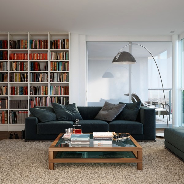
This space is defined by its dimensions in more than the literal sense. Once again, a preference for cubic storage is evident in shelving and this choice is a reflection of the space itself: the overarching floor lamp, the only element that stands in contrast to an indisputably angular approach to composition.
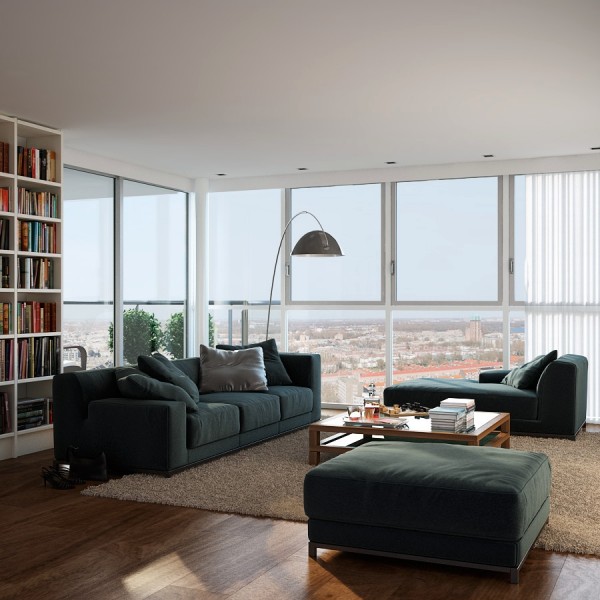
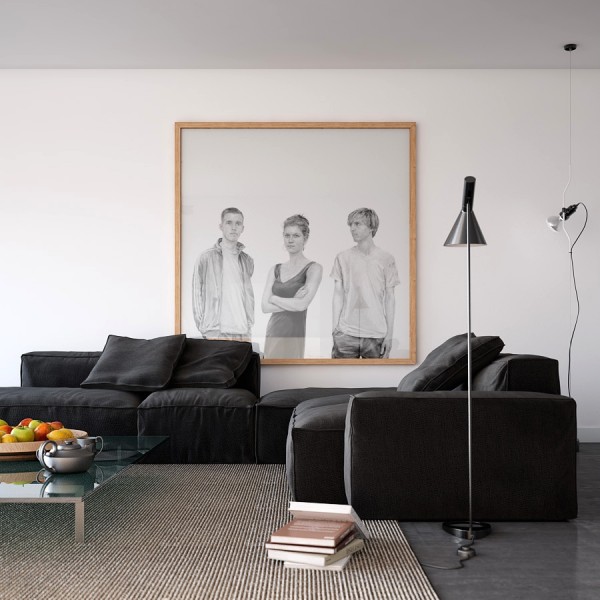
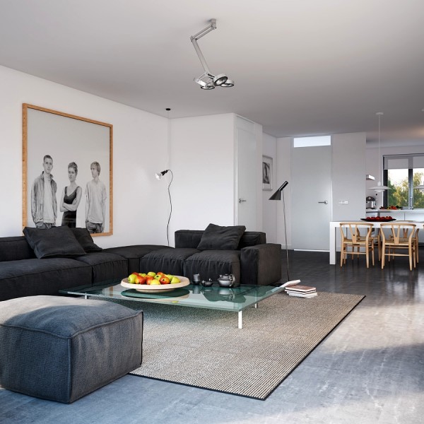
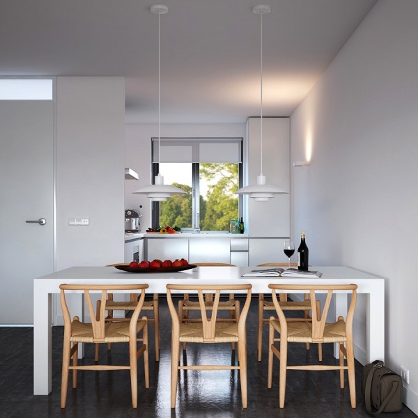
Subtly reminiscent of the first space, this apartment also indulges in an affinity with the industrially modern, which is often dictated by a designer's approach to lighting. What diverts from a strictly industrial ethos with in this space, is an organic influence in styling: notice the way in which the light wood of the portrait frame and dining chairs compliment the heavily textured carpet, which again draws focus back to the industrial foundation of the space in its use of polished concrete.
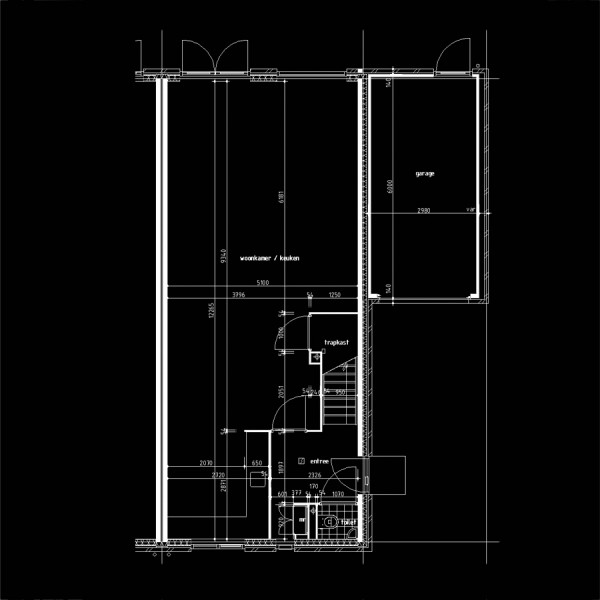
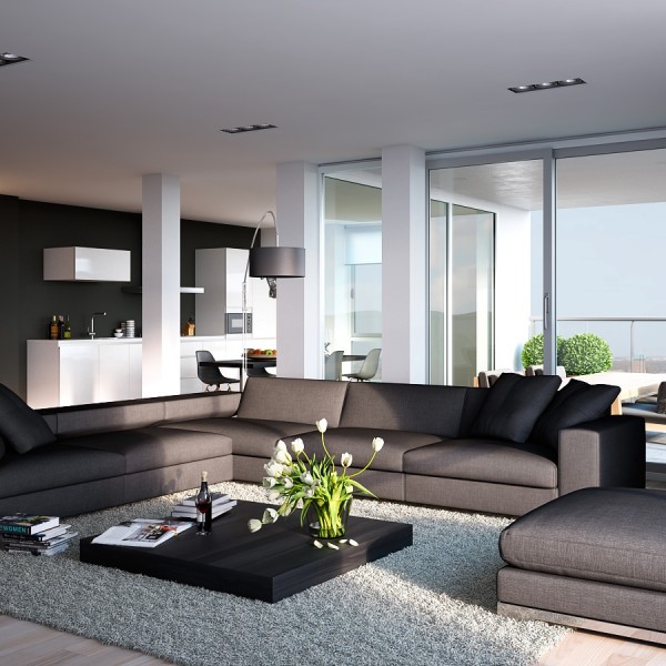
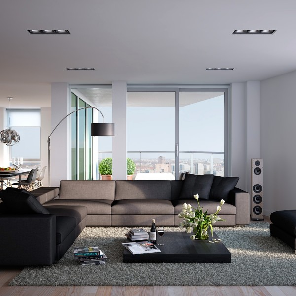
This space, though still modern, exudes an androgynous feel through its amalgamation of sharp lines and masculine palette, and its delicate hand in styling, which takes a decidedly feminine turn in its albeit, casual approach to accessorizing.
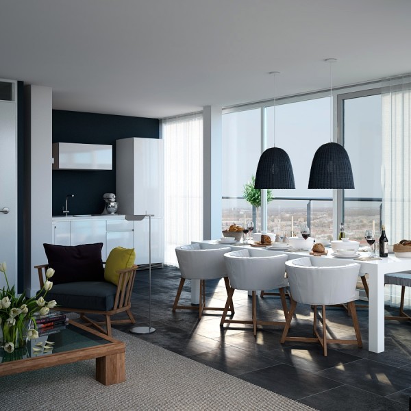
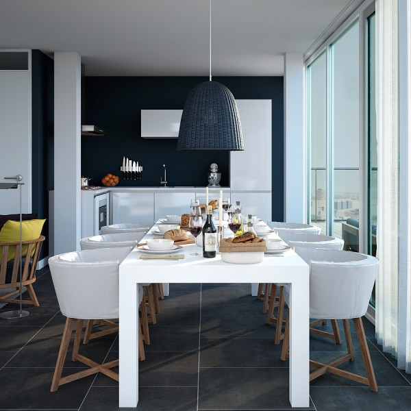
The use of a classically nautical palette and substituting regatta red for a pop of yellow, combined with the elemental energy generated by statement tiles and the wood framed choices in living and dining chairs, results in a modern, relaxed and ever-so-slightly, coastal appeal. But the hero of this space is the pendant lighting, which despite its traditionally industrial form, further solidifies the theme of the space in its rustic and woven aesthetic.
For more regular updates from Home Designing, join us on Facebook.

If you are reading this through e-mail, please consider forwarding this mail to a few of your friends who are into interior design. Come on, you know who they are!


 Modern Bathroom Inspiration 2013
 Audio Video Junkie Nirvana: A Great Home Entertainment Setup
 Follow Home-Designing On Facebook, Twitter
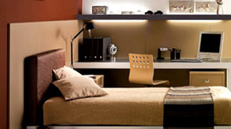 Contemporary Teen Rooms
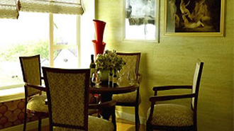 Classic Interior Design
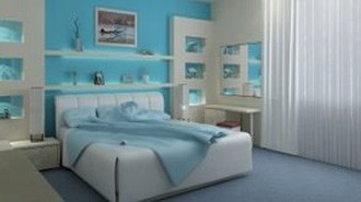 Interior Design Ideas
 Share-kan di facebook


Berminat Dengan Lowongan ini : masukan Komentar anda !
Post a Comment